

Tom Twiby®

Contact Me
Resume.pdf
Outcome
We transformed Australian Ethical's digital presence from a disconnected vendor experience to a cohesive, branded app that gives investors genuine control over their investments.
Design system 100+ components, 13 modules
AccessibilityAA and AAA WCAG compliance
User testing16 participants across two rounds
Platform iOS, Android, and web (Flutter)
The design system provided a scalable foundation for future product releases


User Testing
We ran two rounds of guided testing with 16 participants aged 18 to 78 alongside development sprints. The first round surfaced usability issues in onboarding and data visualisation.
We iterated and re-tested. Users responded positively to dashboard clarity and overall polish, and pushed us to surface more portfolio company detail, shaping the post-MVP roadmap.

Defining the Problem
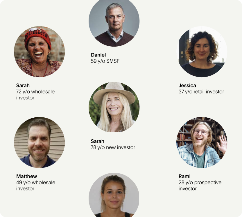
Through stakeholder ideation sessions, we mapped the pain points across the existing experience and identified three core user needs: clear access to portfolio performance, transparency into ethical impact, and a frictionless journey from sign-up to ongoing management. Personas spanning ages 18 to 78 kept us grounded in accessibility and simplicity.
Overview
Managed fund investors had no real visibility into their portfolios. Account information was served through outdated partner vendors, transactions required downloading and emailing PDF forms, and there was no digital touchpoint that reflected the brand they'd bought into. The gap between what Australian Ethical promised and what customers experienced was growing.

My Role
UI Design | Design Systems | Motion Design | Accessibility | User Testing | Prototyping
The Solution
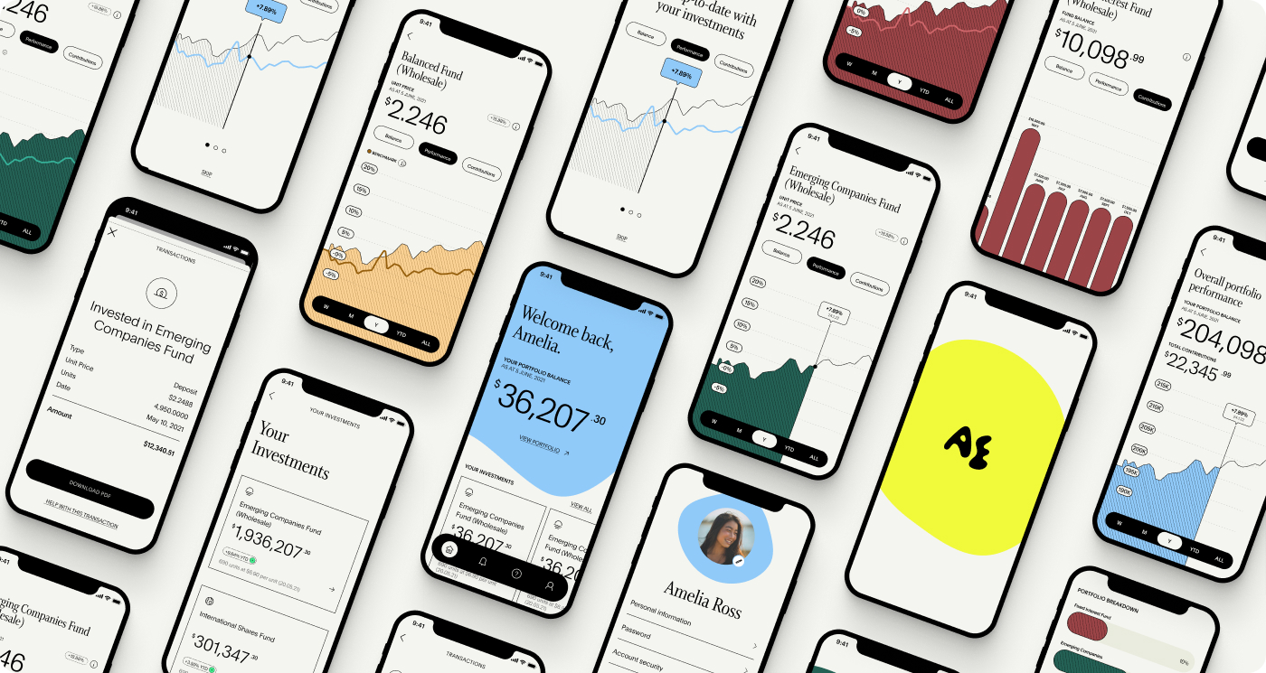
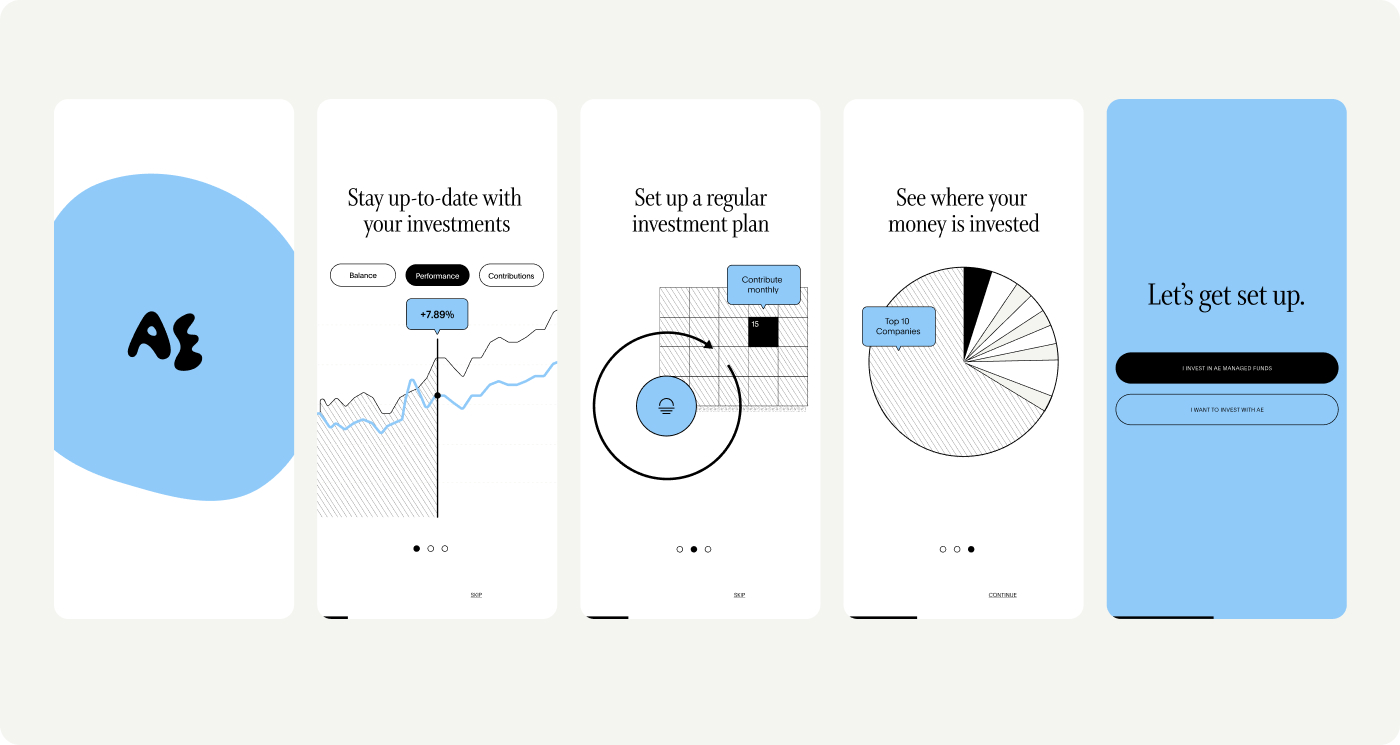
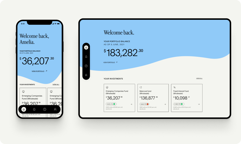
We aligned on a "brilliant basics" MVP, then designed a mobile and web app using Flutter that gave investors genuine control. The experience told the story of Australian Ethical's values while making it easy to track how your money is making a difference.
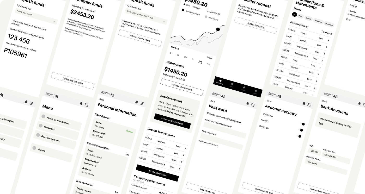
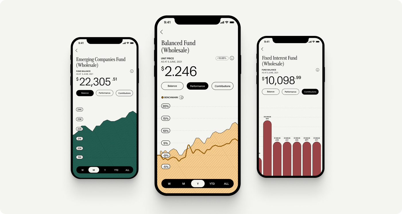
The visual direction was rooted in nature, using Australia's environment to inform colour, grid, motion, and shape. I built the design system from the ground up: 100+ components, 13 modules, responsive across mobile, tablet, and desktop. Accessibility was baked in, with the colour palette meeting AA and AAA contrast standards.
I authored motion guidelines around three principles: delight, educate, or focus the user. Easing curves, transition timing, and interaction patterns were documented to keep everything consistent as the product scaled.
Australian
Ethical App
Making it easy for managed fund investors to stay on top of their earth-changing investments.
Download the App
Tom Twiby®
Contact Me
Resume.pdf
Outcome
We transformed Australian Ethical's digital presence from a disconnected vendor experience to a cohesive, branded app that gives investors genuine control over their investments.
Design system 100+ components, 13 modules
AccessibilityAA and AAA WCAG compliance
User testing16 participants across two rounds
Platform iOS, Android, and web (Flutter)
The design system provided a scalable foundation for future product releases
User Testing
We ran two rounds of guided testing with 16 participants aged 18 to 78 alongside development sprints. The first round surfaced usability issues in onboarding and data visualisation.
We iterated and re-tested. Users responded positively to dashboard clarity and overall polish, and pushed us to surface more portfolio company detail, shaping the post-MVP roadmap.
Defining the Problem
Through stakeholder ideation sessions, we mapped the pain points across the existing experience and identified three core user needs: clear access to portfolio performance, transparency into ethical impact, and a frictionless journey from sign-up to ongoing management. Personas spanning ages 18 to 78 kept us grounded in accessibility and simplicity.
Overview
Managed fund investors had no real visibility into their portfolios. Account information was served through outdated partner vendors, transactions required downloading and emailing PDF forms, and there was no digital touchpoint that reflected the brand they'd bought into. The gap between what Australian Ethical promised and what customers experienced was growing.
My Role
UI Design | Design Systems | Motion Design | Accessibility | User Testing | Prototyping
The Solution
We aligned on a "brilliant basics" MVP, then designed a mobile and web app using Flutter that gave investors genuine control. The experience told the story of Australian Ethical's values while making it easy to track how your money is making a difference.
The visual direction was rooted in nature, using Australia's environment to inform colour, grid, motion, and shape. I built the design system from the ground up: 100+ components, 13 modules, responsive across mobile, tablet, and desktop. Accessibility was baked in, with the colour palette meeting AA and AAA contrast standards.
I authored motion guidelines around three principles: delight, educate, or focus the user. Easing curves, transition timing, and interaction patterns were documented to keep everything consistent as the product scaled.
Australian
Ethical App
Making it easy for managed fund investors to stay on top of their earth-changing investments.
Download the App
Projects
Projects
My AI Approach
My AI Approach
Resume.pdf
Resume.pdf
Tom Twiby®

Contact Me
Resume.pdf
Outcome
We transformed Australian Ethical's digital presence from a disconnected vendor experience to a cohesive, branded app that gives investors genuine control over their investments.
Design system 100+ components, 13 modules
AccessibilityAA and AAA WCAG compliance
User testing16 participants across two rounds
Platform iOS, Android, and web (Flutter)
The design system provided a scalable foundation for future product releases


User Testing
We ran two rounds of guided testing with 16 participants aged 18 to 78 alongside development sprints. The first round surfaced usability issues in onboarding and data visualisation.
We iterated and re-tested. Users responded positively to dashboard clarity and overall polish, and pushed us to surface more portfolio company detail, shaping the post-MVP roadmap.
Defining the Problem
Through stakeholder ideation sessions, we mapped the pain points across the existing experience and identified three core user needs: clear access to portfolio performance, transparency into ethical impact, and a frictionless journey from sign-up to ongoing management. Personas spanning ages 18 to 78 kept us grounded in accessibility and simplicity.
Overview
Managed fund investors had no real visibility into their portfolios. Account information was served through outdated partner vendors, transactions required downloading and emailing PDF forms, and there was no digital touchpoint that reflected the brand they'd bought into. The gap between what Australian Ethical promised and what customers experienced was growing.


My Role
UI Design | Design Systems | Motion Design | Accessibility | User Testing | Prototyping
The Solution
We aligned on a "brilliant basics" MVP, then designed a mobile and web app using Flutter that gave investors genuine control. The experience told the story of Australian Ethical's values while making it easy to track how your money is making a difference.
The visual direction was rooted in nature, using Australia's environment to inform colour, grid, motion, and shape. I built the design system from the ground up: 100+ components, 13 modules, responsive across mobile, tablet, and desktop. Accessibility was baked in, with the colour palette meeting AA and AAA contrast standards.
I authored motion guidelines around three principles: delight, educate, or focus the user. Easing curves, transition timing, and interaction patterns were documented to keep everything consistent as the product scaled.
Australian
Ethical App
Making it easy for managed fund investors to stay on top of their earth-changing investments.
Download the App
Projects
Projects
My AI Approach
My AI Approach
Resume.pdf
Resume.pdf
Tom Twiby®
Contact Me
Resume.pdf
Outcome
We transformed Australian Ethical's digital presence from a disconnected vendor experience to a cohesive, branded app that gives investors genuine control over their investments.
Design system 100+ components, 13 modules
AccessibilityAA and AAA WCAG compliance
User testing16 participants across two rounds
Platform iOS, Android, and web (Flutter)
The design system provided a scalable foundation for future product releases
User Testing
We ran two rounds of guided testing with 16 participants aged 18 to 78 alongside development sprints. The first round surfaced usability issues in onboarding and data visualisation.
We iterated and re-tested. Users responded positively to dashboard clarity and overall polish, and pushed us to surface more portfolio company detail, shaping the post-MVP roadmap.
Defining the Problem
Through stakeholder ideation sessions, we mapped the pain points across the existing experience and identified three core user needs: clear access to portfolio performance, transparency into ethical impact, and a frictionless journey from sign-up to ongoing management. Personas spanning ages 18 to 78 kept us grounded in accessibility and simplicity.
Overview
Managed fund investors had no real visibility into their portfolios. Account information was served through outdated partner vendors, transactions required downloading and emailing PDF forms, and there was no digital touchpoint that reflected the brand they'd bought into. The gap between what Australian Ethical promised and what customers experienced was growing.
My Role
UI Design | Design Systems | Motion Design | Accessibility | User Testing | Prototyping
The Solution
We aligned on a "brilliant basics" MVP, then designed a mobile and web app using Flutter that gave investors genuine control. The experience told the story of Australian Ethical's values while making it easy to track how your money is making a difference.
The visual direction was rooted in nature, using Australia's environment to inform colour, grid, motion, and shape. I built the design system from the ground up: 100+ components, 13 modules, responsive across mobile, tablet, and desktop. Accessibility was baked in, with the colour palette meeting AA and AAA contrast standards.
I authored motion guidelines around three principles: delight, educate, or focus the user. Easing curves, transition timing, and interaction patterns were documented to keep everything consistent as the product scaled.
Australian
Ethical App
Making it easy for managed fund investors to stay on top of their earth-changing investments.
Download the App
Projects
Projects
My AI Approach
My AI Approach
Resume.pdf
Resume.pdf
Tom Twiby®

Contact Me
Resume.pdf
Outcome
We transformed Australian Ethical's digital presence from a disconnected vendor experience to a cohesive, branded app that gives investors genuine control over their investments.
Design system: 100+ components, 13 modules
Accessibility: AA and AAA WCAG compliance
User testing: 16 participants across two rounds
Platform: iOS, Android, and web (Flutter)
The design system provided a scalable foundation for future product releases


User Testing
We ran two rounds of guided testing with 16 participants aged 18 to 78 alongside development sprints. The first round surfaced usability issues in onboarding and data visualisation.
We iterated and re-tested. Users responded positively to dashboard clarity and overall polish, and pushed us to surface more portfolio company detail, shaping the post-MVP roadmap.
The Solution
We aligned on a "brilliant basics" MVP, then designed a mobile and web app using Flutter that gave investors genuine control. The experience told the story of Australian Ethical's values while making it easy to track how your money is making a difference.
The visual direction was rooted in nature, using Australia's environment to inform colour, grid, motion, and shape. I built the design system from the ground up: 100+ components, 13 modules, responsive across mobile, tablet, and desktop. Accessibility was baked in, with the colour palette meeting AA and AAA contrast standards.
I authored motion guidelines around three principles: delight, educate, or focus the user. Easing curves, transition timing, and interaction patterns were documented to keep everything consistent as the product scaled.
Defining the Problem
Through stakeholder ideation sessions, we mapped the pain points across the existing experience and identified three core user needs: clear access to portfolio performance, transparency into ethical impact, and a frictionless journey from sign-up to ongoing management. Personas spanning ages 18 to 78 kept us grounded in accessibility and simplicity.
Overview
Managed fund investors had no real visibility into their portfolios. Account information was served through outdated partner vendors, transactions required downloading and emailing PDF forms, and there was no digital touchpoint that reflected the brand they'd bought into. The gap between what Australian Ethical promised and what customers experienced was growing.

My Role
UI Design | Design Systems | Motion Design | Accessibility | User Testing | Prototyping
Australian
Ethical App
Making it easy for managed fund investors to stay on top of their earth-changing investments.
Download the App
Projects
Projects
My AI Approach
My AI Approach
Resume.pdf
Resume.pdf
Tom Twiby®

Contact Me
Resume.pdf
Outcome
We transformed Australian Ethical's digital presence from a disconnected vendor experience to a cohesive, branded app that gives investors genuine control over their investments.
Design system: 100+ components, 13 modules
Accessibility: AA and AAA WCAG compliance
User testing: 16 participants across two rounds
Platform: iOS, Android, and web (Flutter)
The design system provided a scalable foundation for future product releases
User Testing
We ran two rounds of guided testing with 16 participants aged 18 to 78 alongside development sprints. The first round surfaced usability issues in onboarding and data visualisation.
We iterated and re-tested. Users responded positively to dashboard clarity and overall polish, and pushed us to surface more portfolio company detail, shaping the post-MVP roadmap.
The Solution
We aligned on a "brilliant basics" MVP, then designed a mobile and web app using Flutter that gave investors genuine control. The experience told the story of Australian Ethical's values while making it easy to track how your money is making a difference.
The visual direction was rooted in nature, using Australia's environment to inform colour, grid, motion, and shape. I built the design system from the ground up: 100+ components, 13 modules, responsive across mobile, tablet, and desktop. Accessibility was baked in, with the colour palette meeting AA and AAA contrast standards.
I authored motion guidelines around three principles: delight, educate, or focus the user. Easing curves, transition timing, and interaction patterns were documented to keep everything consistent as the product scaled.
Defining the Problem
Through stakeholder ideation sessions, we mapped the pain points across the existing experience and identified three core user needs: clear access to portfolio performance, transparency into ethical impact, and a frictionless journey from sign-up to ongoing management. Personas spanning ages 18 to 78 kept us grounded in accessibility and simplicity.
Overview
Managed fund investors had no real visibility into their portfolios. Account information was served through outdated partner vendors, transactions required downloading and emailing PDF forms, and there was no digital touchpoint that reflected the brand they'd bought into. The gap between what Australian Ethical promised and what customers experienced was growing.
My Role
UI Design | Design Systems | Motion Design | Accessibility | User Testing | Prototyping
Australian
Ethical App
Making it easy for managed fund investors to stay on top of their earth-changing investments.
Download the App