

Tom Twiby®

Contact Me
Resume.pdf
Defining the Problem
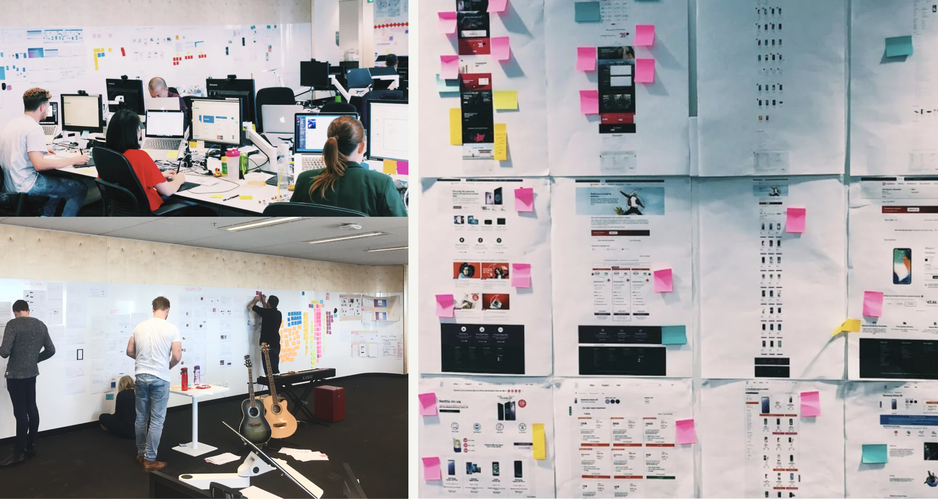
Embedded as a six-person R/GA team within Telstra for eight months, we audited customer journeys and ran workshops to uncover inconsistencies. Key insight: the system needed a unifying creative idea, not just a component library.
The Problem
Telstra had 20+ digital products with almost no consistent design standards. Style guides were scattered, manually maintained, and out of sync. Teams designed in isolation. Accessibility wasn't enforced.
My Role
UI Design | Design Systems | Motion Design | Accessibility | Visual Direction
The Solution
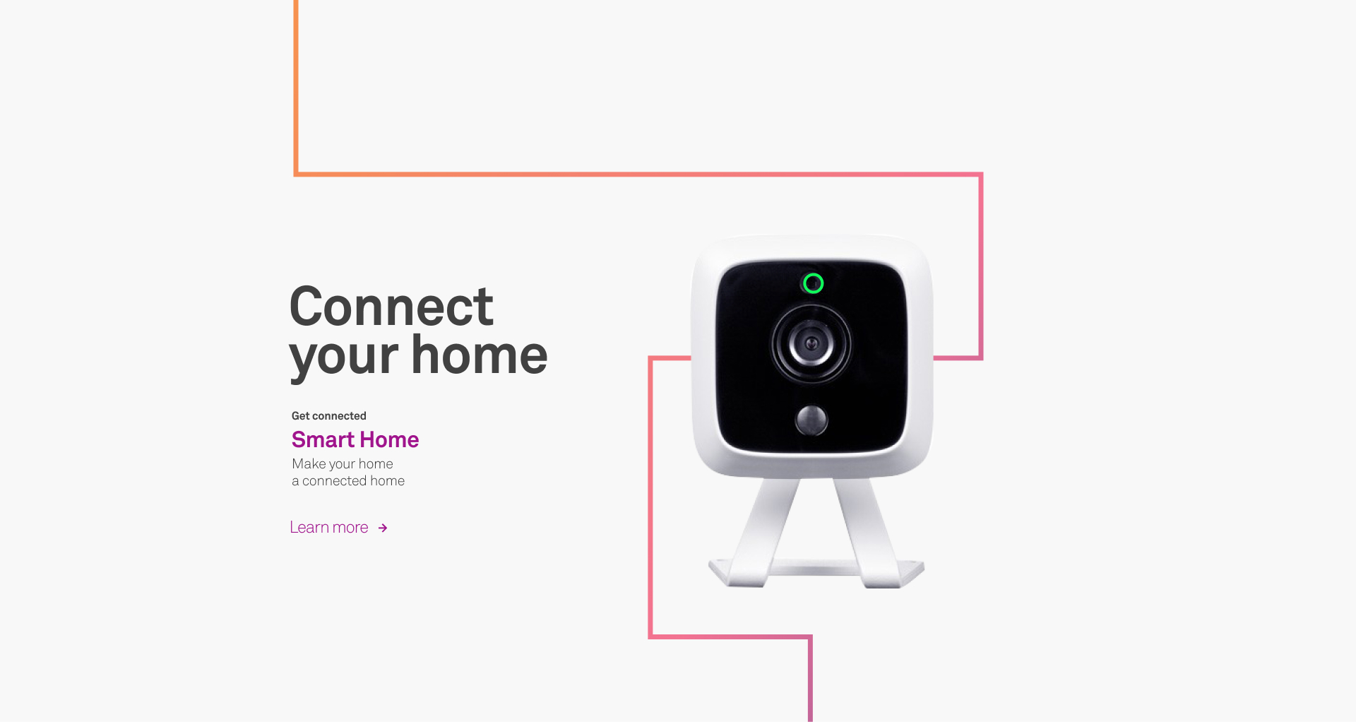
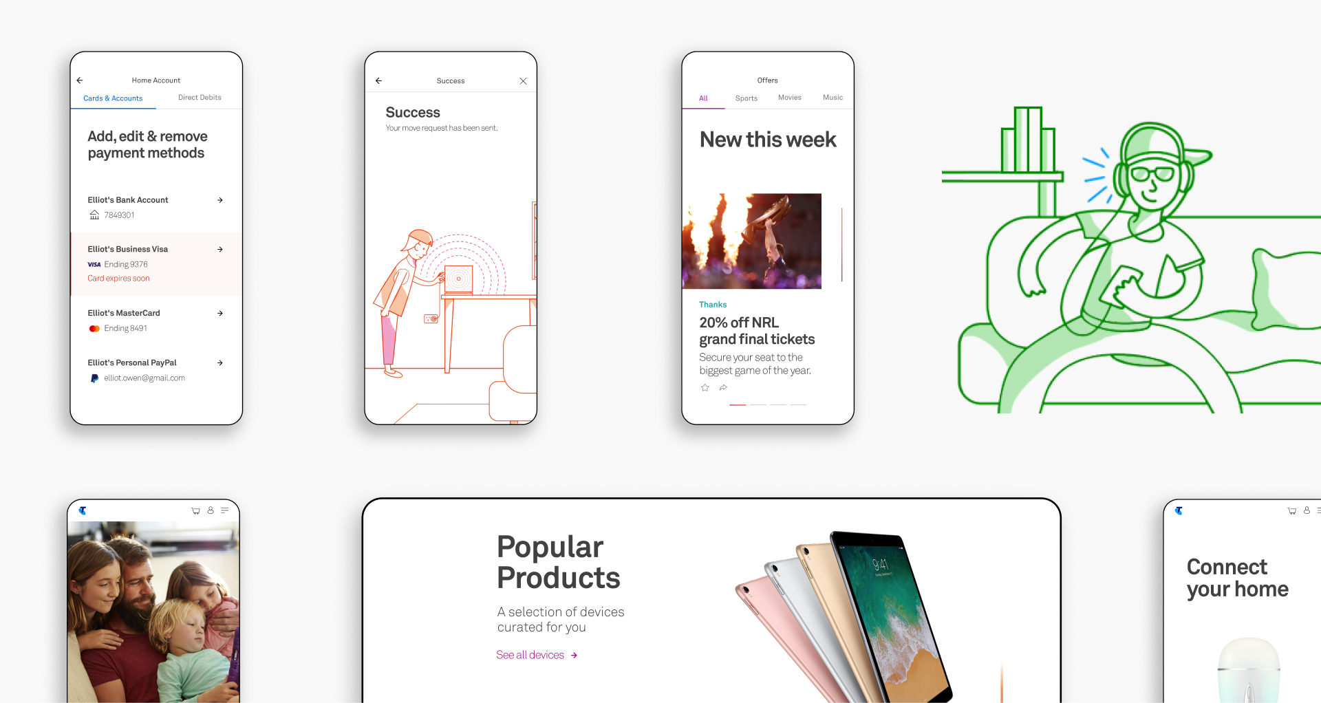
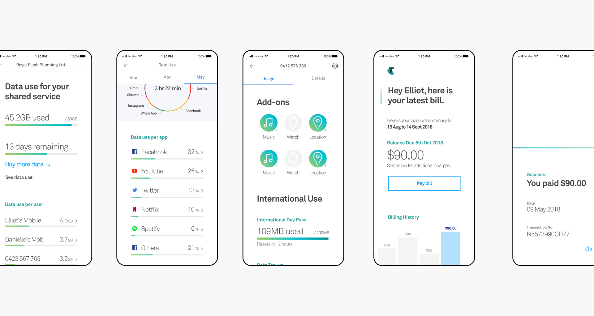
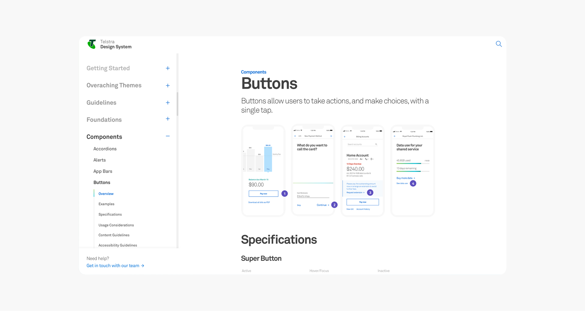
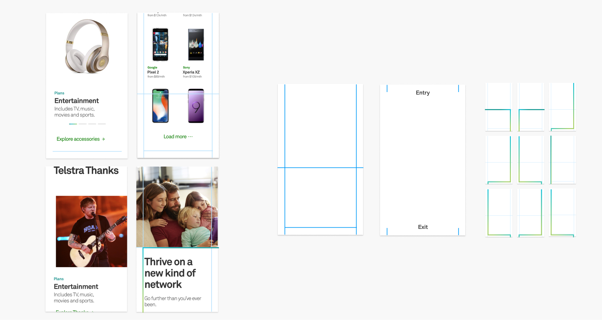
We developed "Light in Motion," a visual concept that turned Telstra's brand colours and gradients into functional design elements rather than decoration. It scaled across digital and physical touchpoints.
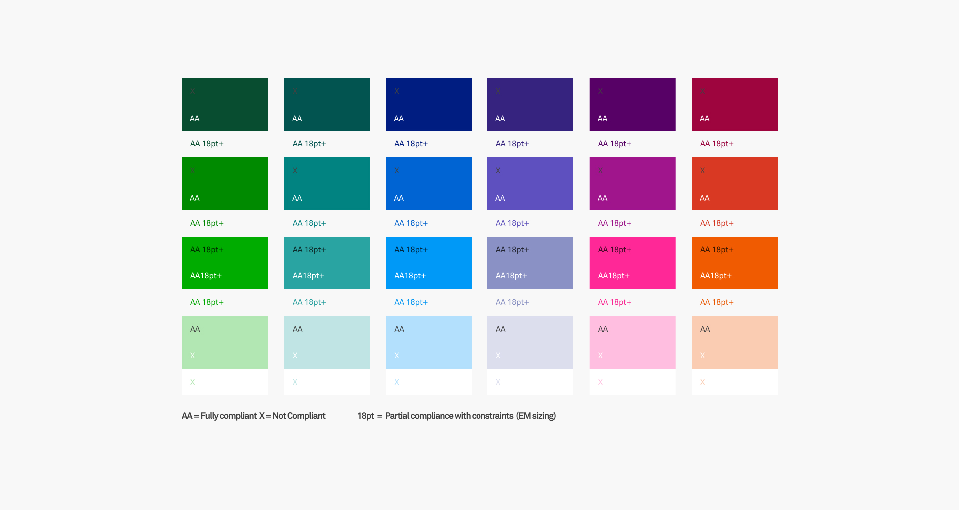
The system was built using atomic design with hundreds of components grounded in real scenarios: phone orders, payments, loyalty, and retail. AA WCAG accessibility shaped every decision from colour to interaction patterns.
I contributed motion guidelines built on three principles: delight, educate, or focus. Timing, easing, and transformation rules kept interactions consistent across digital, retail, advertising, and social.
Telstra Design System
A unified design language for Australia's largest telecommunications brand.
Outcome
We replaced Telstra's fragmented patchwork of style guides with a unified, scalable, living design system. It gave Telstra's design community a shared language and set of standards, enabling teams to ship faster with consistent, accessible, on-brand UI across web and native apps. The system supported common flows like plan comparison, device selection, and purchase, and the motion language established a quality bar for the brand going forward.
Tom Twiby®
Contact Me
Resume.pdf
Defining the Problem
Embedded as a six-person R/GA team within Telstra for eight months, we audited customer journeys and ran workshops to uncover inconsistencies. Key insight: the system needed a unifying creative idea, not just a component library.
The Problem
Telstra had 20+ digital products with almost no consistent design standards. Style guides were scattered, manually maintained, and out of sync. Teams designed in isolation. Accessibility wasn't enforced.
My Role
UI Design | Design Systems | Motion Design | Accessibility | Visual Direction
The Solution
We developed "Light in Motion," a visual concept that turned Telstra's brand colours and gradients into functional design elements rather than decoration. It scaled across digital and physical touchpoints.
The system was built using atomic design with hundreds of components grounded in real scenarios: phone orders, payments, loyalty, and retail. AA WCAG accessibility shaped every decision from colour to interaction patterns.
I contributed motion guidelines built on three principles: delight, educate, or focus. Timing, easing, and transformation rules kept interactions consistent across digital, retail, advertising, and social.
Telstra Design System
A unified design language for Australia's largest telecommunications brand.
Outcome
We replaced Telstra's fragmented patchwork of style guides with a unified, scalable, living design system. It gave Telstra's design community a shared language and set of standards, enabling teams to ship faster with consistent, accessible, on-brand UI across web and native apps. The system supported common flows like plan comparison, device selection, and purchase, and the motion language established a quality bar for the brand going forward.
Projects
Projects
My AI Approach
My AI Approach
Resume.pdf
Resume.pdf
Tom Twiby®

Contact Me
Resume.pdf
The Solution
We developed "Light in Motion," a visual concept that turned Telstra's brand colours and gradients into functional design elements rather than decoration. It scaled across digital and physical touchpoints.
The system was built using atomic design with hundreds of components grounded in real scenarios: phone orders, payments, loyalty, and retail. AA WCAG accessibility shaped every decision from colour to interaction patterns.
I contributed motion guidelines built on three principles: delight, educate, or focus. Timing, easing, and transformation rules kept interactions consistent across digital, retail, advertising, and social.
Defining the Problem
Embedded as a six-person R/GA team within Telstra for eight months, we audited customer journeys and ran workshops to uncover inconsistencies. Key insight: the system needed a unifying creative idea, not just a component library.
The Problem
Telstra had 20+ digital products with almost no consistent design standards. Style guides were scattered, manually maintained, and out of sync. Teams designed in isolation. Accessibility wasn't enforced.
My Role
UI Design | Design Systems | Motion Design | Accessibility | Visual Direction
Telstra Design System
A unified design language for Australia's largest telecommunications brand.
Outcome
We replaced Telstra's fragmented patchwork of style guides with a unified, scalable, living design system. It gave Telstra's design community a shared language and set of standards, enabling teams to ship faster with consistent, accessible, on-brand UI across web and native apps. The system supported common flows like plan comparison, device selection, and purchase, and the motion language established a quality bar for the brand going forward.